Cloud-Native Media Delivery Platform
Scalable live and scheduled media workflows for enterprise organisations
Project Overview
A cloud-native platform for live and scheduled media delivery across organisations. Integrated with AWS to provision media pipelines on-demand, with streamlined management for entitlements, billing, and stream quality.
My Role
Lead UI/UX Designer
Led the redesign of the platform UI to improve usability and scalability. Defined user flows for configuring sources, scheduling streams, and managing access. Collaborated with backend teams to align UI with system logic and infrastructure provisioning.
Frontend Engineer
Contributed to frontend implementation with a component-based architecture. Built a Storybook design system that evolved into a React Component Library, now adopted across multiple products in the organisation.
Strategic Impact
Transformed a technically complex platform into a user-friendly tool, enabled scalable media workflows, and improved collaboration between design, engineering, and product teams.
UX/UI Contributions
-
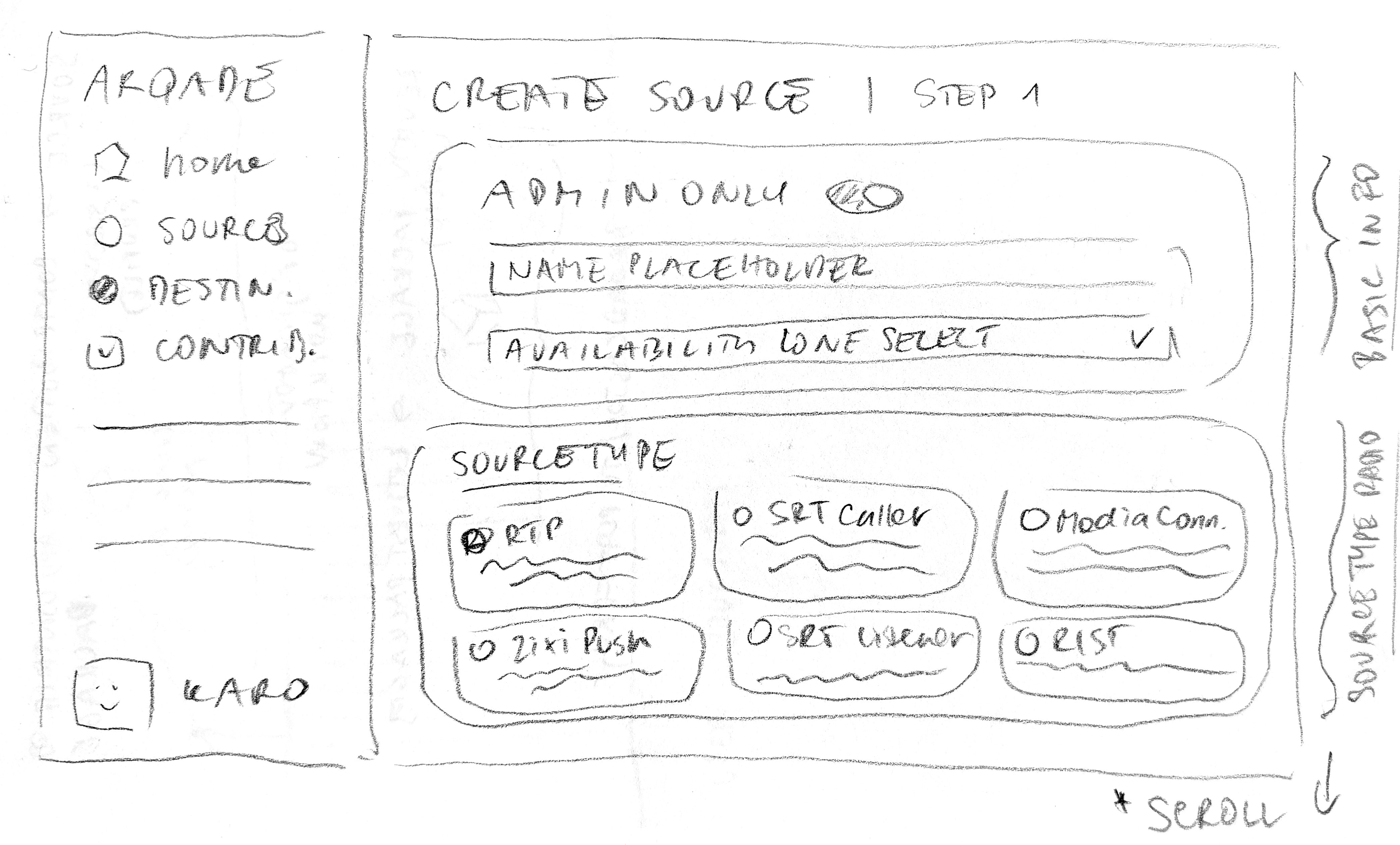
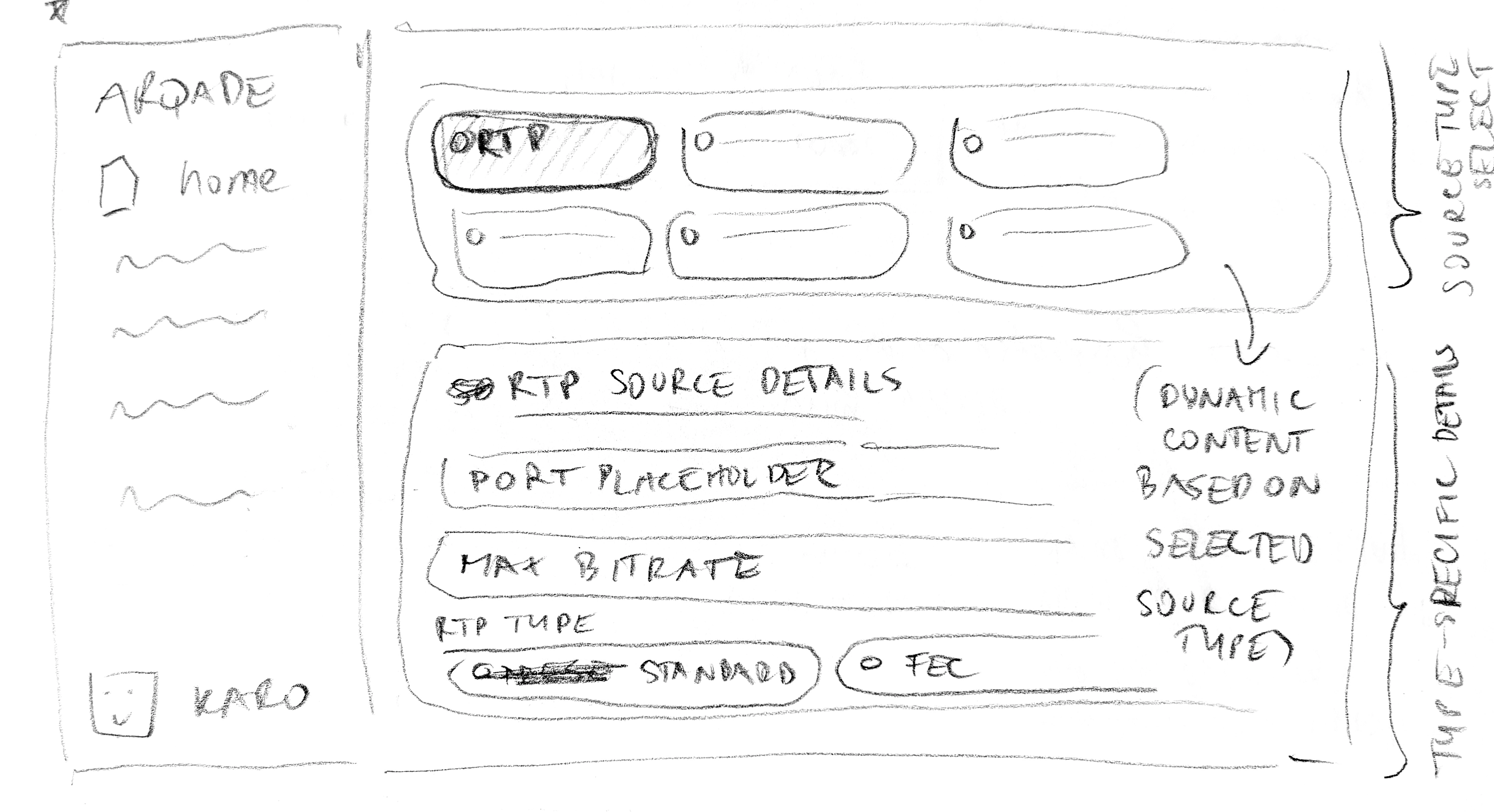
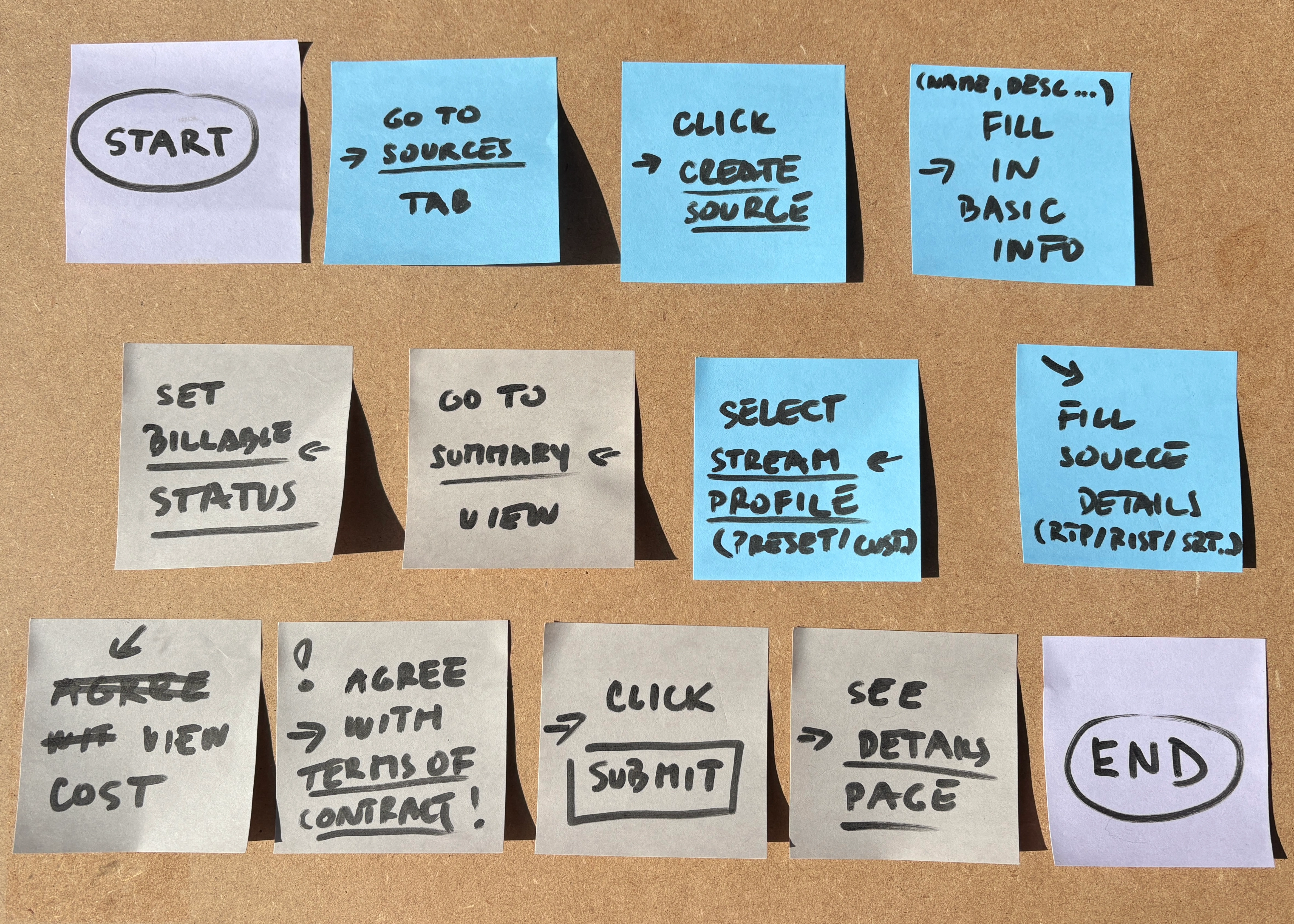
Streamlined Source Configuration
I designed interfaces for creating, editing, viewing, and listing ingest points, supporting multiple protocols (RTP, SRT, Zixi). Advanced settings were simplified into intuitive forms with contextual help, reducing errors and setup time for technical users.
-
Efficient Contribution Management
Built flows for defining stream types, scheduling, redundancy, and profile locking. Both event-based and channel-based contributions were supported, helping operators manage multiple streams without conflicts and improving operational efficiency.
-
Flexible Destination Setup
Created configuration interfaces for output endpoints with redundancy and failover logic. Users could easily handle pre-created and dynamic destinations, reducing misconfigurations and improving reliability.
-
Delivery Configuration with Clear Feedback
Designed the delivery setup to manage routing, transcoding, and cross-region delivery. Visual indicators highlighted redundancy, billing, and stream health, allowing operators to quickly detect and resolve issues.
-
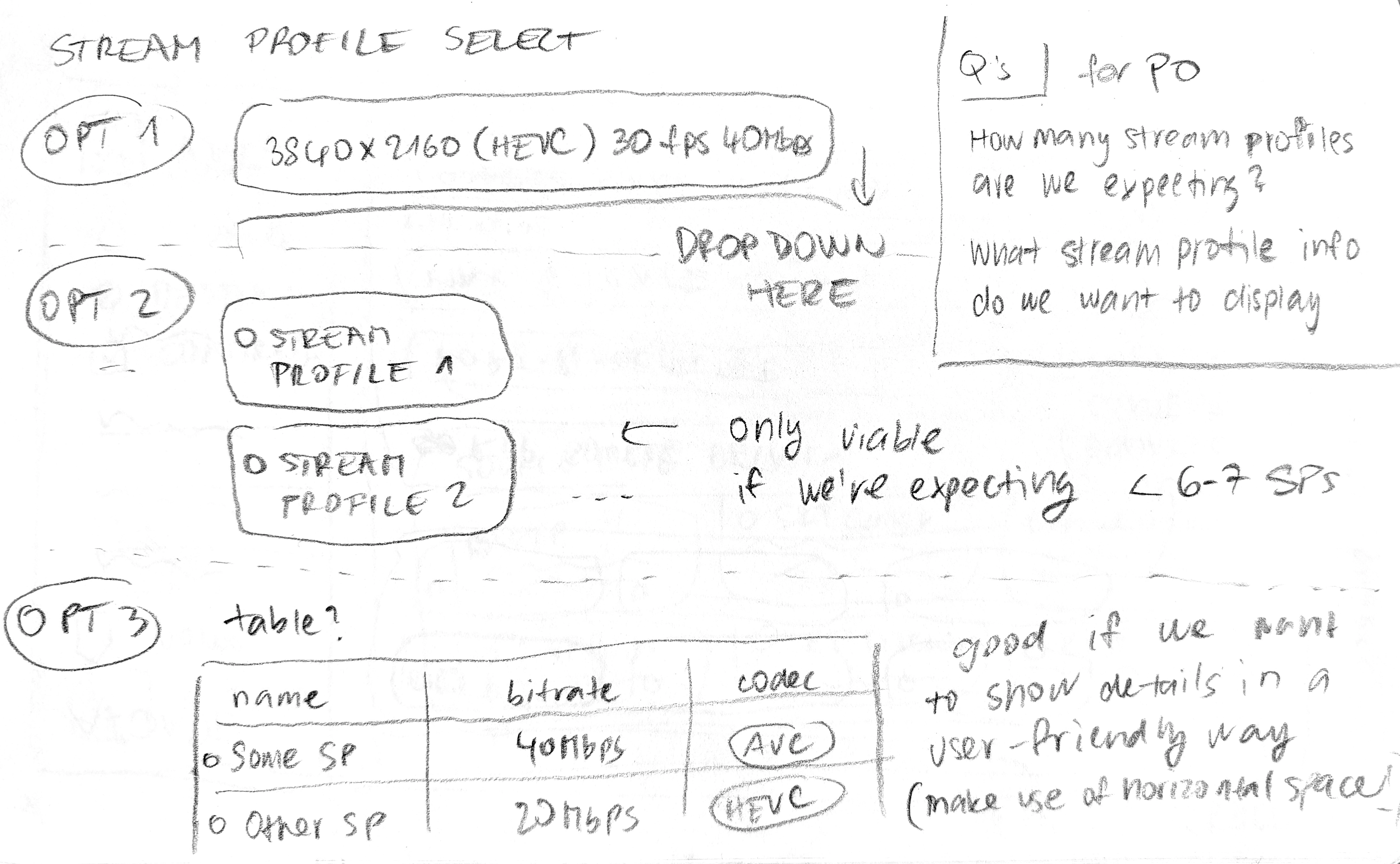
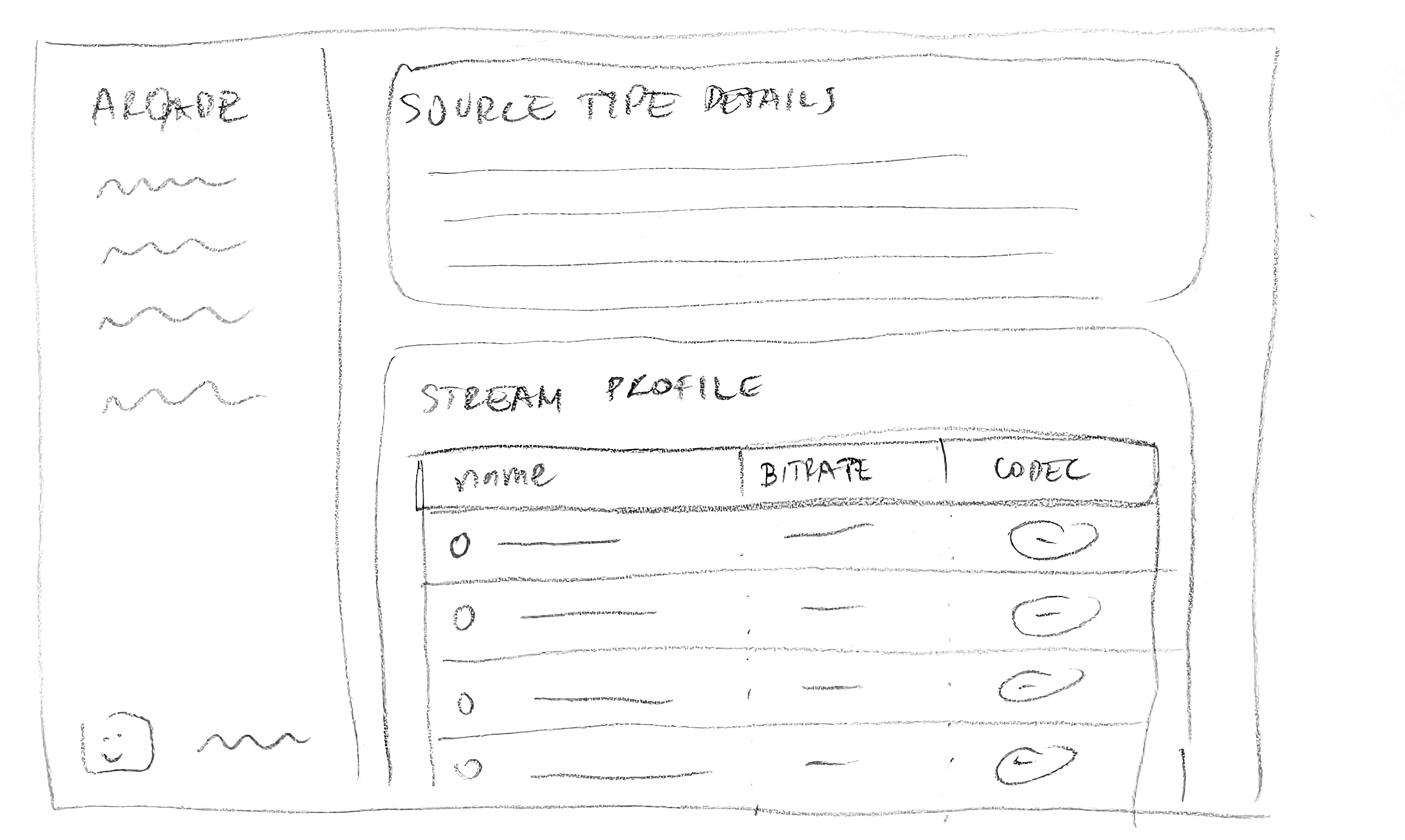
Modular Stream Profile Design
Developed interfaces for defining stream parameters (resolution, codec, bitrate, framerate, GOP, colorspace). Profiles were reusable across workflows, which saved time and ensured consistency across the platform.
-
Scalable Navigation & Menu System
Designed a navigation system to support complex operational workflows across multiple services. Patterns were built for scalability and modularity, ensuring that as new features were added, users could maintain efficiency and clarity.
Design Process
Auditing the Legacy Experience
The project began with a UX audit of the existing interfaces. I evaluated them against Jakob Nielsen’s heuristic principles to identify usability issues, inconsistencies, and accessibility gaps. This helped me frame the conversation with stakeholders not just around aesthetics, but also around usability and compliance including pushing for alignment with WCAG 3.0 guidelines where possible.
Collaborative Flow Mapping
To align design with how the system actually worked, the scrum team ran a workshop with key stakeholders. Together, we walked through critical user flows for core operational tasks. This uncovered hidden dependencies in backend logic, which influenced how the UI needed to guide users through complex decisions. Mapping these flows created a shared understanding across design, product, and engineering.
Turning Flows into Wireframes
With the flows clarified, I translated them into wireframes and prototypes for the most important screens. These prototypes weren’t just static mockups. They were clickable journeys that let us test the logic and interactions early, reducing the risk of rework later in development.
Testing and Iteration
Because the user base was highly specialised, we worked with a small but expert group of internal users. I conducted short interviews, collected feedback from our internal chat channels, and observed how they navigated the prototypes.
I pushed for feedback during sprint reviews, ensuring that design work was visible and testable at each iteration. This kept stakeholders engaged, gave developers early visibility into upcoming UI patterns, and helped us validate design decisions before they became expensive to change.Many of the stakeholders were accustomed to more traditional, waterfall-style delivery, where design and development happened in silos. By integrating lightweight testing and iteration into the sprint cadence, I helped them experience the benefits of incremental improvements and reduced friction when handing off to engineering.
Bridging Design and Development
Throughout the process, I partnered closely with backend engineers to ensure the UI aligned with system logic. For example, some edge cases in operational flows required creative solutions that balanced technical constraints with user clarity.
The design philosophy emphasised modularity, reusability, and scalability. Components and patterns were built to support company-wide adoption, laying the foundation for a unified design system before a formal design team was in place.
Designing Core Workflows
When I turned to the core operational pages, my goal was to design interfaces that could support a wide range of user workflows while staying consistent across the platform. Each service (Sources, Contributions, Destinations, Delivery, and Stream Profiles) shared a common set of actions:
- Creating a record through structured forms.
- Reviewing a summary of entered data prior to submission.
- Accessing detailed pages to view or edit existing records.
- Navigating contribution lists to track and manage multiple entries.
Impact
The redesign significantly improved usability and efficiency for setting up streams and managing deliveries, reducing the time and cognitive load for expert users. New users experienced faster onboarding, while consistent patterns and modular workflows laid a strong foundation that the formal design team later scaled across the platform. Raising accessibility and usability standards improved inclusivity and minimised errors, and iterative collaboration with stakeholders became part of the sprint rhythm, helping the team embrace more modern, user-centered practices. On the technical side, the work contributed to a reusable React component library that is now being adopted across multiple products, enabling a more unified design system across the organization. Overall, the platform became more reliable, scalable, and user-friendly, setting the stage for future growth.
Tools Used
Figma, React, Storybook, Jira, Confluence